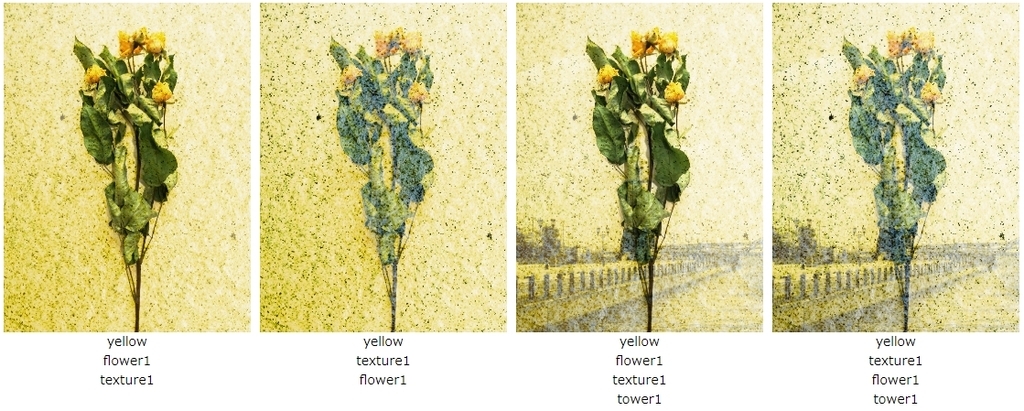
CSSのブレンドモード"background-blend-mode"を使って、写真を2枚重ねたイメージの作成を試した。
先日、CSSのブレンドモード"background-blend-mode"を使って、写真にカラーフィルタをかけたような色の加工を試した。↓

今回、CSSのブレンドモード"background-blend-mode"を使って、写真を2枚重ねたイメージの作成を試した。
重ね合わせの順番を変えることで、出来上がるイメージが変わる。写真を複数枚重ねることもできるし、色を重ねることもできる。
↓ 実際、試したWebページが以下。
https://ok2nd.sakura.ne.jp/css-filter/blend-overlay.html
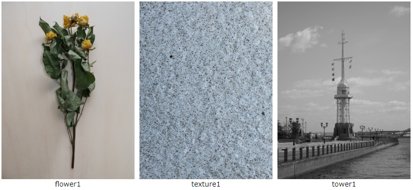
【オリジナル写真】
【background-blend-mode: hard-light;の場合】
<style>
.img-box {
	width: 300px;
	height: 400px;
	margin: 0;
	padding: 0;
	display: block;
}
.hard-light1 {
	background-image: url(img/flower1.jpg), url(img/texture1.jpg);
	background-repeat: no-repeat;
	background-blend-mode: hard-light;
	background-size: cover;
}
.hard-light2 {
	background-image: url(img/texture1.jpg), url(img/flower1.jpg);
	background-repeat: no-repeat;
	background-blend-mode: hard-light;
	background-size: cover;
}
.hard-light3 {
	background-image: url(img/flower1.jpg), url(img/texture1.jpg), url(img/tower1.jpg);
	background-repeat: no-repeat;
	background-blend-mode: hard-light;
	background-size: cover;
}
.hard-light4 {
	background-image: url(img/texture1.jpg), url(img/flower1.jpg), url(img/tower1.jpg);
	background-repeat: no-repeat;
	background-blend-mode: hard-light;
	background-size: cover;
}
</style>

<div class="img-box hard-light1"></div>
<div class="img-box hard-light2"></div>
<div class="img-box hard-light3"></div>
<div class="img-box hard-light4"></div>

【更に色を重ねる】
<style>
.blue { background: #0bd no-repeat; }
.yellow { background: #db0 no-repeat; }
</style>

<div class="img-box blue hard-light1"></div>
<div class="img-box blue hard-light2"></div>
<div class="img-box blue hard-light3"></div>
<div class="img-box blue hard-light4"></div>